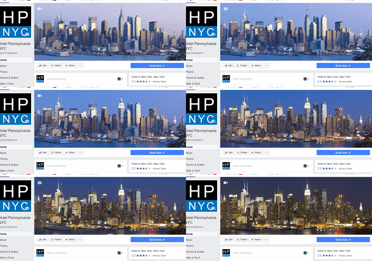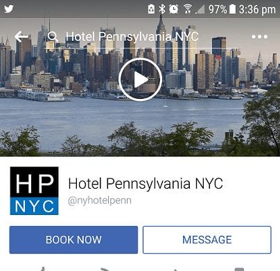
Facebook has added a new video element to Business Pages.
If short videos in your friends’ profile pic weren’t enough for you, allow me to introduce to you the Facebook Cover Video. As with most updates, this one might bring you more questions than answers but I personally love it. I first noticed this new feature with one of my clients, Hotel Penn in New York. As with any design update, this new format will be abused and not appreciated for the positive elements that it can provide. With my client, rather than go overly hard with a pitch, I merely wanted to highlight the amazing location that it happens to call home: New York City.
Getting down to business though, here are the questions that you probably have and my answers to said questions.
What sort of video do I need?
Firstly, your video needs to be between 20-90 seconds long. That’s right. No seizure-inducing Boomerangs here. This video is still short form but 90 seconds provides A LOT of room to tell a story.
The dimensions for the video have to be at least 820 x 312 pixels but Facebook recommends 820 x 462 pixels. The recommended is very close to an exact 16:9. That being said, you’re going to need to crop a bit off the top and/or bottom when you actually position it. Keep that in mind.
I didn’t receive any errors or messages about format but I uploaded an MP4. MOV is probably just fine. If you venture outside of those, I care not to help you.
How does it look on mobile?

This should be your second question, if not your first. The video does not interrupt the user’s experience at all. It only offers to enrich it. It is worth noting though that since they opted for a play button, you’re going to want to make sure that your opening frame is something that you wouldn’t mind being your cover photo. More often than not, most of my clients’ Facebook views are on mobile. I suspect most of you are in the same boat. Plan your frames accordingly.
What kind of video should I use?
Social media is your chance to take your brand’s narrative and try to match it up with a narrative that will emotionally resonate with your core community. That’s a fancy way of saying that you should stick with something cool that people will enjoy. This is not your chance to create a silent version of your most recent TV spot that highlights a sale. That’s not what people want out of your organic posts and it’s not something that people will enjoy in your profile design.
Here is a list of videos that I’d recommend based on industry.
- Hospitality – Stick with the scenery. If you have an amazing entrance, interior, or view; go with that. People are a plus.
- Travel Destination – Put your location in context. Put the call out for some great user-generate-content and you’ll get it. Then, weave a story together from different perspectives.
- Restaurant – Showcase people having a good time and/or food prep. A lot can be said for a couple frames of a burger over fire being mixed with some people laughing and toasting.
- Car Company – Whatever the newest car is, showcase that MOFO driving around. It’s a bonus if you can get footage regionally.
- Gym – Showcase one of your classes. This is a chance to bring one of those sweet Instagram videos to the big(ger) screen.
- Apartment Complex or Real Estate – Get some drone video going around your properties and the neighborhood. Don’t break any laws while you do it.
- Insurance Agency – I really only care about this one for Allstate because storyboarding a silent film for Mayhem would make me so happy. Wouldn’t it make you happy?
What should I definitely not do?

You definitely shouldn’t use this as a way to push off your latest sale. If you’ve paid attention to your organic posts at all, you’ll likely notice that people don’t respond as well to sales. Moreover, it can hurt your brand’s equity if the first thing that they see is a sale.
You definitely shouldn’t use a grainy or pixelated video. This is the cover photo/video of your brand. It needs to echo who you are. I doubt that who you are as a brand is somebody who can’t take a video in landscape format.
You definitely don’t want to make it too busy. Ultimately, the CTA button in the bottom right and the content below is what you want people focusing on most. Don’t have something so busy that it holds the eye too long without providing value.
Now, go forth and be creative. If you come up with something cool, hit us with it on Twitter. You can find us at @phrasinginc or me at @twel5.

